Thunderclap, the Newsletter of Rolling
Thunder Computing
Volume 11, Number 2, Winter of 2010
In this issue:
Blatant Self Promotion: David Platt's Upcoming Training Classes
Prism, the Composite Application Library and Composite Application
Guidance
Live In Reykjavik Iceland, Feb 16-18, 2010 (taught in English)
ONLINE April 5-7, 2010
Developing Software That Doesn't Suck
Live in
Darmstadt Germany, February 22-24 (taught in English)
Microsoft Insurance Value Chain for ACORD
ONLINE March 19, 2010
Programming
Microsoft Health Vault,
ONLINE March
15-17, 2010
More Blatant Self Promotion:
If you love my writing, or if you love to hate it (and if you're a subscriber to this newsletter, one of these is probably true), you should read MSDN magazine for February (not yet published at the time of this writing, but coming soon). I can't say anything specific about it just now because of NDAs, but I think you will enjoy it, and subsequent issues.
Feature Article: A Surprisingly Good Silverlight Screen
Book from David Platt: Why Software Sucks (and What You can Do About It)
I frequently use this newsletter to draw attention to bad user interface designs. There’s nothing like the sunlight of public scorn to make UI designers and developers see the error of their ways. Even if the guy I’m bashing doesn’t learn anything from it, at least other UI designers and developers can learn from the public flaying. So it is only fair that I should publicly praise a good job when I see it. They are way too few and far between, but here’s a good one.
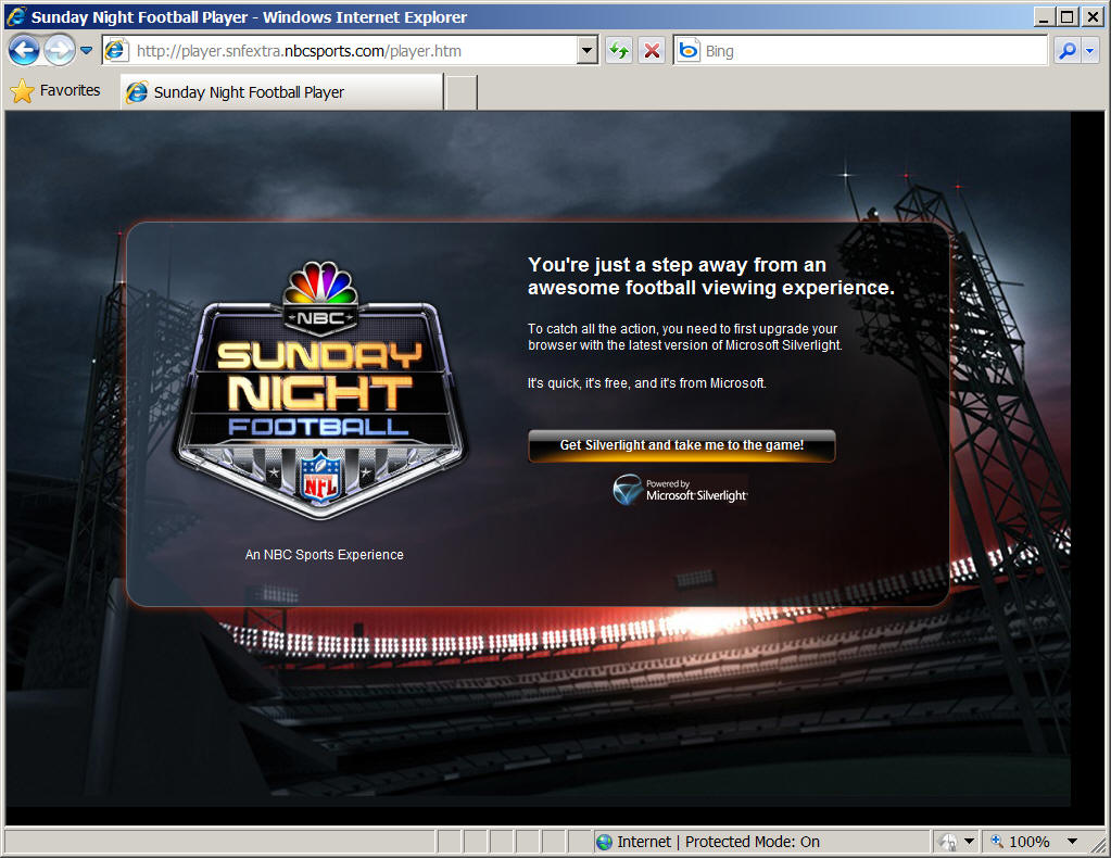
Sunday Night Football is an American football game shown to viewers of broadcast and cable TV, on (you guessed it) Sunday nights. It is also simulcast over the web via NBCSports.com, which streams its content via Microsoft Silverlight.
If the user doesn’t already have Silverlight installed on his machine, then he has to download it and install it before he can watch the game. He sees the screen below, which tells him what to do in order to accomplish this goal, which is to click on one button. This screen is extremely effective on a number of levels, as much for what it does not do as for what it does.
The user of this page is a football fan, probably male, probably young, probably with a beer at his elbow and a couple more inside him and the rest of the case nearby. He’s come to this page to watch a football game. Maybe he knew that he could do that before he came to the NBCSports.com, maybe he just discovered it while browsing that site for something else. One way or another, he’s worked his way down through several navigation screens to get here, the last stop before actually seeing the game. But he probably hasn’t watched a game here before, or he’d already have Silverlight installed and wouldn’t be seeing this screen.
What’s the user’s goal here? To get to the action before he misses anything, or his beer buzz wears off, or the beer works its way through his system and he has to pee. He doesn’t want to spend any time on this page at all. He wants to do the thing that needs to be done (give permission to install Silverlight) as quickly and easily as possible and get on to the game.
That should be the web site’s goal as well. And the designers in this case realize that. They don’t put up any dancing video buttons to distract his attention. They don’t demand any sign up, or offer tutorials or long winded explanations. They don’t ask, or even allow, the user to think very much. The only thing he can do, other than leave via the back button or typing in a different address, is to click the button and install Silverlight. The isolation and the lack of options are extremely effective.
Some graphics designers viewing it through their own eyes instead of a user’s, would say that this screen is effective because of the elaborate graphics – the inviting picture of the stadium, the trademark on the left so he’ll know what he’ll get, the intricate shading on the button, etc. And these are not bad. They don’t get in the way. I’ll agree that they help somewhat; that they don’t distract as elaborate graphics sometimes do. And delivering them won’t slow down any user with enough bandwidth to successfully watch the game. But I would argue that they are almost superfluous in this case.
I contend that the user interface battle has been won by carefully selecting the wording on the text strings and the button, and to a lesser extent their fonts and sizes, in a way that the splashy graphics don’t affect much, pro or con. I further contend that the battle could very easily have been lost by writing or even formatting these text strings badly, in a way that no graphics could even begin to fix.
Note that everything in the text is expressed in terms of the user’s desires – watch the football game, now, please – not in terms of the software. You don’t see anything saying, “Gosh, you don’t have Silverlight installed in your Control Panel,” or “You have Silverlight 2.0.12, we need to upgrade you to 3.0.1,” or, “Can we interest you in the .NET Framework while you’re here?” The top text string, in bright white and a large font, doesn’t talk about implementation at all. It says, “You’re just one step away from an awesome viewing experience.” That’s what the user wants, that’s why he came here. The position, the size, and the color of the string grab the user’s attention first, and the words tells him that he’s on the right track for what he wants, but still has to do a little something.
As the user’s eyes move down the page, he’ll probably next notice the button, skipping over the next two sentences in their smaller, lighter font. The button’s font is the next largest, the orange splash calls for attention and lights up when the mouse hovers over it. The text reads “Get Silverlight and take me to the game!” Again, the button’s action is expressed in terms of the user’s desire. It doesn’t start explaining that “Silverlight is a cross-browser, cross-platform and cross-device browser plug-in that helps companies design, develop and deliver applications and experiences on the Web,” as the Silverlight web site says. No. “You want football?” says the button. “Of course you do, that’s why you came here. Cool. No problem. Click here and you’ve got football.”
A relatively small percentage of users are going to wonder what this Silverlight thing is. They’ll start scanning back over the text and encounter the middle two sentences. Again, these don’t even try to explain Silverlight in any serious way. The first sentence identifies it as a browser upgrade, of which notion most users have some understanding, especially in the young male demographic. The second sentence, “It’s quick, it’s free, and it’s from Microsoft,” attempts to remove any objections or suspicions that might prevent the user from installing it. “Don’t worry, man. It won’t take long, it won’t cost anything, and it’s from a name that you trust, or at least have learned to live with. Hakuna matata, just click here and you’ve got the game.”
This page doesn’t even contain a “Learn More” link, for the small percentage of users who might want to research Silverlight before installing it. That’s a bold move. Geeks never feel comfortable without knowing exactly what’s going on. It must have been very hard for the page’s designers to omit such a link. I wonder how much internal squabbling they went through to reach that decision. But this user, as we said, isn’t a geek. He doesn’t really care what’s going on. He wants to see the damn game. This screen understands that and works with it. A user who a) doesn’t already understand Silverlight and b) wants to is a very rare combination, and he can easily get that information through a search engine. It doesn’t affect the decision of very many users whether to install or not, so the designers don't distract the vast majority of their users with its presence.
As Donald Norman wrote in his magnum opus, The Design of Everyday Things: “The next time you pick up an unfamiliar object and use it smoothly and effortlessly on the first try, stop and examine it: the ease of use did not come about by accident. Someone designed the object carefully and well.”
This is, admittedly, a tiny example. But the designer figured out, very carefully, who the user was and what the user wanted, and gave it to him. Many, many more pages should be designed this well.
Until next time, as Red Green would say, "Keep your stick on the ice."
Why Software Sucks (and What You Can Do About It)
ISBN 0-321-46675-6
Sample Chapter Online at www.whysoftwaresucks.com
It's finally out! Anyone whose spoken with me in the last couple of years probably got an earful about the latest bee in my bonnet, the book entitled Why Software Sucks. I’m sure that I’ve inflicted sample chapters on just about everyone I know.
It's gotten a storm of publicity, primarily from a Reuters wire service article that ran during the first week of the new year. It was picked up in the electronic editions of such publications as the such as the New York Times (http://www.nytimes.com/reuters/technology/tech-software-platt.html) , Fox News, (http://www.foxnews.com/story/0,2933,241578,00.html), and PC Magazine (http://www.pcmag.com/article2/0,1759,2078820,00.asp).
I've started a new blog based on it, at www.suckbusters.com . It's dedicated to the notion that software shouldn't suck. Instead, software should Just Work.
The title was originally my idea, but I also love the subtitle, suggested by my editor at A-W. I’ve always thought that the right subtitle can really make a book. Like the 60’s bestseller Everything You Always Wanted to Know About Sex (But Were Afraid to Ask). Or Werner von Braun’s autobiography, entitled I Aim for the Stars. Humorist Mort Sahl suggested that its subtitle ought to be, But Sometimes I Hit London. (If you don’t get that last one, go look up von Braun online. As Tom Lehrer famously sang about him in the sixties: “ … A man whose allegiance is ruled by expedience … ‘Once the rockets are up, who cares where they come down? That’s not my department,’ says Werner von Braun.”)
This is my first book aimed at end users, not programmers. Early returns from this market are highly positive. My barber, the librarian at my local public (dead tree edition) library, and the contractor who built my house, all report that early chapters are informative, entertaining, and easy to read.
I’m still working on the “what you can do about it,” piece. If you have any thought as to how ordinary users can make their voices heard, I’d like to hear them. Use the contact info link of this web site, if you don’t already have my email. Thanx.
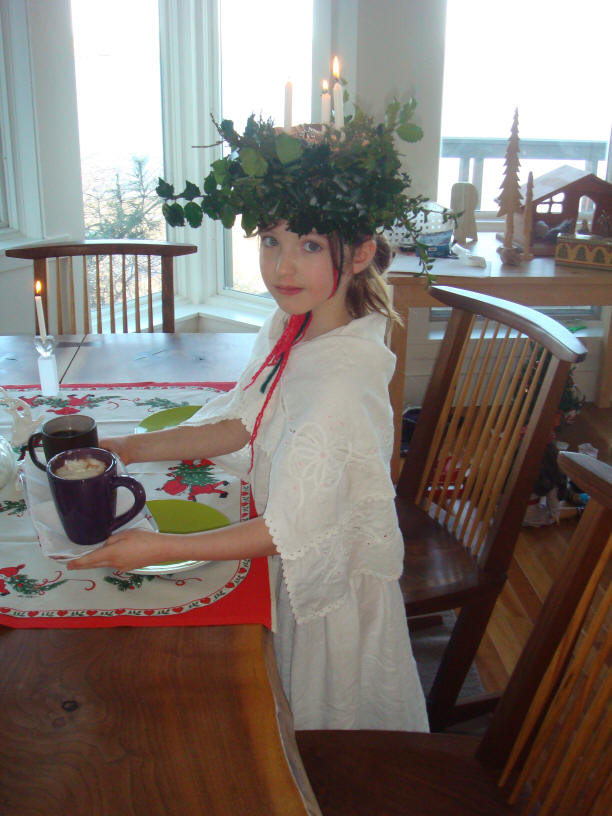
And now, the moment for which I know you've all been waiting -- the pictures of my two girls. Lucy turned 7 years old and in first grade. Annabelle is now 9 1/2 and in third grade. Here Lucy dresses as St Lucia the Light Bringer, bringing light to our home during the dark of the year
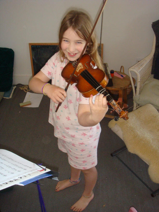
Annabelle is making astonishing progress with her violin. She only started in September, and already the cats have stopped running away when she practices:
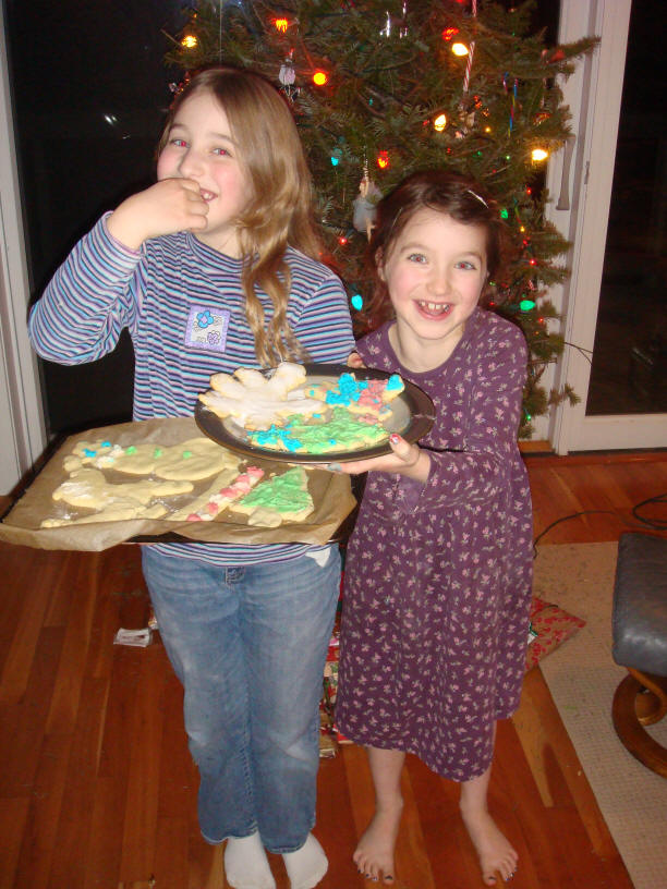
They squabble as all siblings do, but always seem to come together in the end, especially when there are sweets involved:
Thunderclap is free, and is distributed via e-mail only. We never rent, sell or give away our mailing list, though occasionally we use it for our own promotions. To subscribe, jump to the Rolling Thunder Web site and fill in the subscription form.
Legal Notices
Thunderclap does not accept advertising; nor do we sell, rent, or give away our subscriber list. We will make every effort to keep the names of subscribers private; however, if served with a court order, we will sing like a whole flock of canaries. If this bothers you, don't subscribe.
Source code and binaries supplied via this newsletter are provided "as-is", with no warranty of functionality, reliability or suitability for any purpose.
This newsletter is Copyright © 2009 by Rolling Thunder Computing, Inc., Ipswich MA. It may be freely redistributed provided that it is redistributed in its entirety, and that absolutely no changes are made in any way, including the removal of these legal notices.
Thunderclap is a registered trademark ® of Rolling Thunder Computing, Inc., Ipswich MA. All other trademarks are owned by their respective companies.