Thunderclap, the Newsletter of Rolling
Thunder Computing
Volume 10, Number 2, Spring 2009
In this issue:
Blatant Self Promotion: David Platt's Training Classes
Programming Microsoft Health Vault, Online May 26-28 2009
Prism, the Composite Application Library and Composite Application Guidance, ONLINE May 18-20
Microsoft Insurance Value Chain for ACORD, ONLINE May 22
Feature Article: Two Major Web Sites That Cause Physical Pain To Their Users
Book from David Platt: Why Software Sucks (and What You can Do About It)
I'm experiencing physical, not mental, but physical pain from navigating two major web sites. I want to publicly air the pain in my neck, and see if you think the same as I do.
It always amazes me when web site designers mess up site navigation. How hard can it be? You show links to the pages that you have. You try to give the user some clue as to where he’ll go when you click on it. You do it in some form that the user recognizes as clickable, sometimes a menu, sometimes a button, sometimes just underlined text.
Above all, you do not, repeat NOT, make the user think about how to use your navigation links. It must, not should, but MUST, be unconscious. The user hasn’t come to your web site to make you happy or appreciate your design brilliance. He (or she, as we’ll see) has come here to do something for himself – to solve a problem, to find some information, to be entertained. He wants to think only about his own interests, not you. At all. Ever. Your mother might admire the brilliance of your site, and then again she might not. Your user never does. The sooner you give him what he wants, so he can get on with the rest of his life, the happier he’ll be. These sites make the user work for it, and they shouldn't.
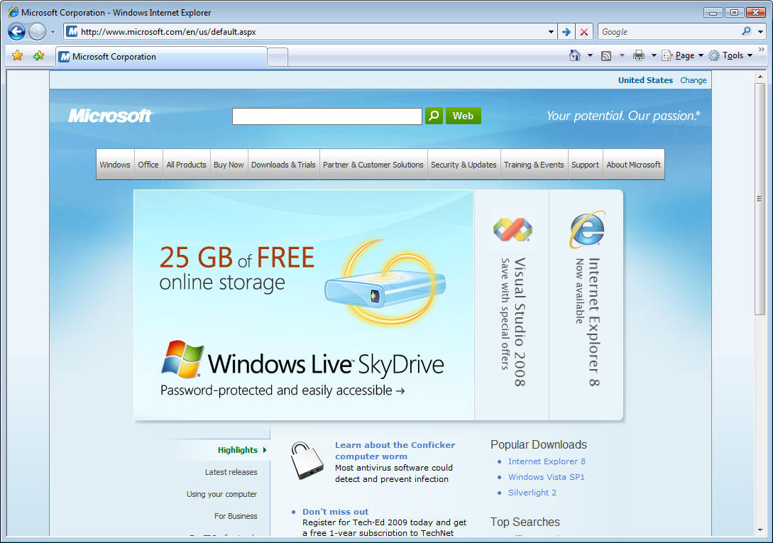
Here’s the first one, at Microsoft.com, of all places. Can you tell me what’s wrong with it?
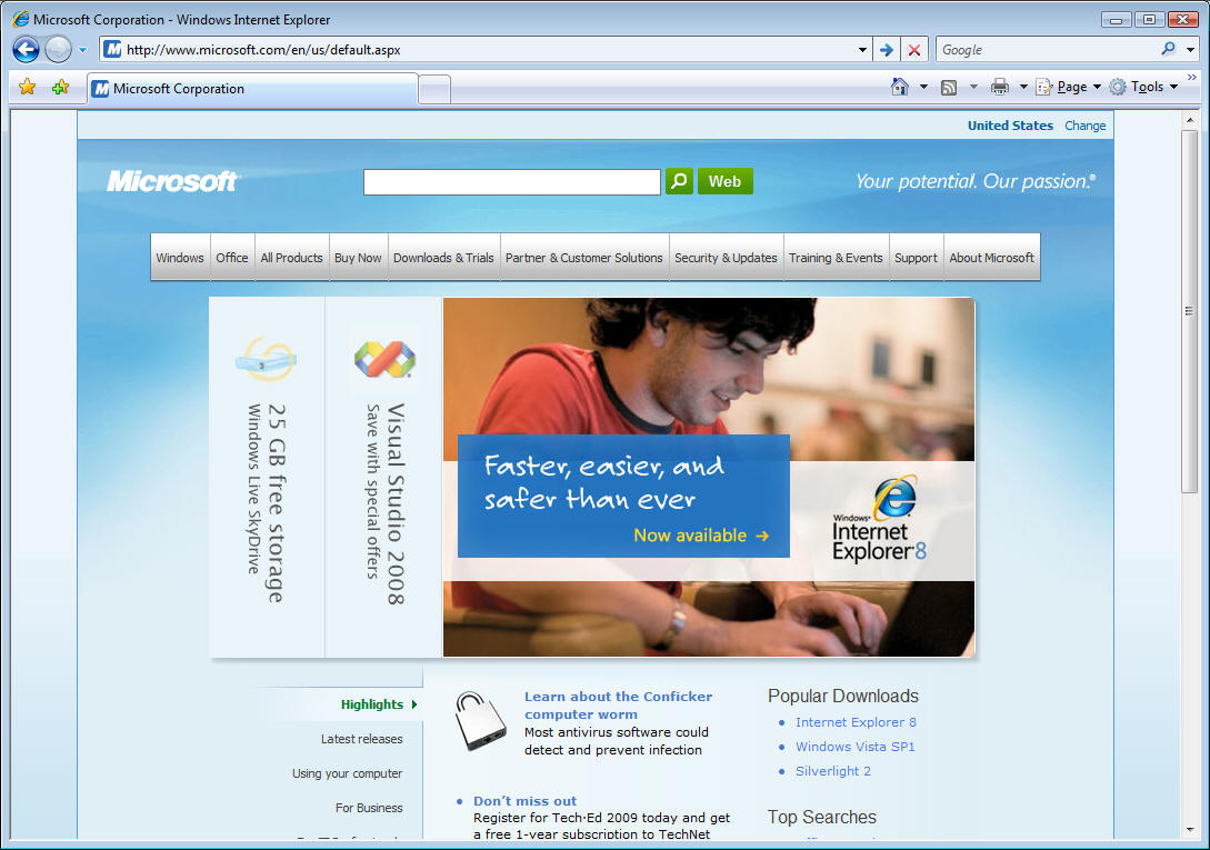
I'll give you a hint. If you look at it for a few seconds, it changes to the one below:
This design has two main problems. First, the labels on the large buttons are written vertically, as on a book spine, not horizontally, as on every other web navigation object that I’ve ever seen. You have to tilt your head sideways to read them. We tolerate that on bookshelves because we’re constrained by the form factor of our preferred mode of storage, books standing vertically on a shelf . We also tolerate it because the titles on all the adjacent books, usually the whole shelf, sometimes the whole wall, are oriented similarly, so tilting our head for one book title lets us read the others without further motion. But no such constraint applies here, the choice of orientation is gratuitous. The web designers are making you tilt your head for the sake of making you tilt your head. Furthermore, unlike a bookshelf, the rest of the text and links are horizontal. So I have to tilt and un-tilt my head several times to find the link that I want. That's not something I want random strangers inflicting on me.
The second problem is the placement of the navigation buttons. They move around, depending on the image that's currently being shown in the main panel. Sometimes they're all on the right (upper figure), sometimes they're all on the left (lower figure), sometimes there's one on each side (not shown). If you want the link to Visual Studio 2008, sometimes it's on the left side and sometimes its on the right. It’s confusing as hell. If I stop and track it for a while, I can figure it out, but I shouldn't have to do that. And like ducks in a shooting gallery, they move around while I'm thinking about clicking them. If I wanted a shooting gallery game, I'd have gone to a different site.
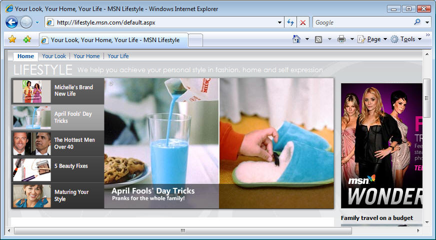
If you insist on having changing images on your web site to highlight different items in the main panel, for Pete's sake put the links horizontal like the rest of the world. And don't change their placement, so I don't have to time my mouse clicks like a shooting gallery to get the one that I want. The MSN Lifestyle page (below) shows a better way to accomplishing this. The links are all horizontal and all on the left. The changing display panel is to the right of them, the current selection indicated by a highlight. I don't have to think at all. I couldn't think much about it even if I wanted to.
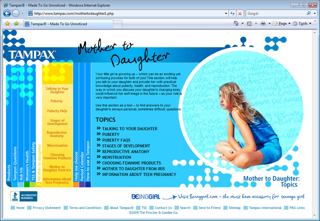
As annoying as this problem is on Microsoft.com, it's even worse on Tampax.com, see the screen shot below. The navigation menu is on the lower left, with the text running vertically, but UP this time. You have to tilt your head to the left to read them. At least Microsoft follows the English-language convention of starting at the top, as a book spine. I don’t know of any vertical writing in English that runs from bottom to top. It’s done that way on German book spines, as I see in the translation of my Understanding COM+ ( COM+ Verstehen, still available at amazon.de) but last I looked, this was the Tampax.com US site.(They make you select your country before showing you their home page, another pet peeve of mine.) See this:

And then, after choosing the top-level link that you want, it opens up and the sub-links are written horizontally, in the normal way. So some navigation labels read from left to right, others from bottom to top. It’s confusing as hell.
Both of these sites violate what I call the Principle of Least Astonishment, which states simply that astonishing the user is a bad idea, so you want to do it as little as possible. Refining that idea, I do hereby coin Plattski’s Law of Minimum Chiropractic, which states simply that forcing a user to visit a chiropractor will not make him happy, so you want to do that as little as possible. In this study published in the Journal of the Canadian Chiropractic Association, 54 % of the entire population reported suffering neck pain in the past six months. That means no neck tilting without a darn good reason. Making a user who already has a sore neck tilt it to read your navigation links is sadistic. The techniques used on these home pages inflict pain on more than half of the population, and therefore violate it.
I call sites like this the "revenge of the art majors". They’re tired of all the jokes about their poverty relative to us computer science grads. (Q: What does an art major say to a computer science major? A: “Would you like fries with that?”) When we criticize their designs, they reply with jargon-laden bullshit (which, in fairness, we geeks have always foisted on them and the rest of the world) and dare us to challenge it.
Well, I’m doing that here. Designers of these sites, listen up: Pain = Bad. Confusion = Bad. Pain + Confusion = Bad + Bad. Your use of these techniques causes pain and confusion, and therefore is bad. Stop me if I get too technical here.
I’m not saying that all web sites need to be battleship gray, or that there isn’t a place on the web team for a GOOD artistic designer, one who understands the communication capabilities and constraints of the web medium. Watching my daughters (6 years old, and almost 9, which is why I went to Tampax.com) play on AmericanGirl.com or MyLittlePony.com shows what a good graphic designer can do. Look at these:
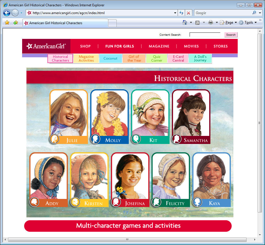
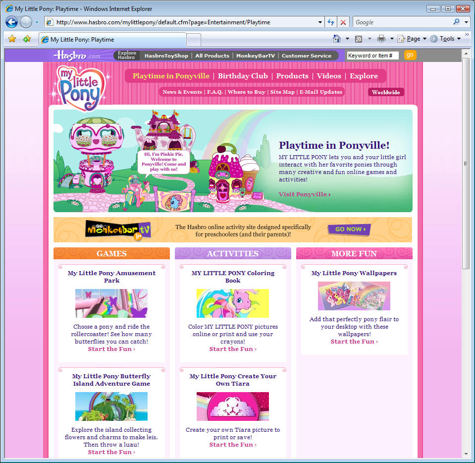
When my daughters play on these sites, they don't think of themselves as using a computer, or a web browser, or even a web site. They are helping Felicity create a sampler, or coloring the tiara that Rainbow Bright is wearing. The designers of these sites have succeeded in creating what Donald Norman called The Invisible Computer in his book of that title. These interfaces succeed precisely because they are unnoticed by their users. The navigation fades into the background instead of calling attention to itself. The designers of Microsoft.com and Tampax.com should do the same.
I will offer any of the Microsoft.com and Tampax.com site designers the right of verbatim reply in this space, unedited, provided that they begin their responses the words, “Forcing my users to tilt their heads to use my site makes them happier because …” Somehow I don’t think I’ll get many replies.
Your user is not you. He doesn’t care about your cleverness. He doesn’t want to think about you. He doesn’t want to think at all. The more you make him think, the more you’re going to lose him. Or her.
Ready to learn more? I'll come to your company and teach my week-long class, Developing Software That Doesn't Suck. Your users will thank you for it, and your shareholders will thank you for making your users happy. You didn't think you'd get through this whole article without some blatant self promotion, did you?
Until next time, as Red Green would say, "Keep your stick on the ice."
Why Software Sucks (and What You Can Do About It)
ISBN 0-321-46675-6
Sample Chapter Online at www.whysoftwaresucks.com
It's finally out! Anyone whose spoken with me in the last couple of years probably got an earful about the latest bee in my bonnet, the book entitled Why Software Sucks. I’m sure that I’ve inflicted sample chapters on just about everyone I know.
It's gotten a storm of publicity, primarily from a Reuters wire service article that ran during the first week of the new year. It was picked up in the electronic editions of such publications as the such as the New York Times (http://www.nytimes.com/reuters/technology/tech-software-platt.html) , Fox News, (http://www.foxnews.com/story/0,2933,241578,00.html), and PC Magazine (http://www.pcmag.com/article2/0,1759,2078820,00.asp).
I've started a new blog based on it, at www.suckbusters.com . It's dedicated to the notion that software shouldn't suck. Instead, software should Just Work.
The title was originally my idea, but I also love the subtitle, suggested by my editor at A-W. I’ve always thought that the right subtitle can really make a book. Like the 60’s bestseller Everything You Always Wanted to Know About Sex (But Were Afraid to Ask). Or Werner von Braun’s autobiography, entitled I Aim for the Stars. Humorist Mort Sahl suggested that its subtitle ought to be, But Sometimes I Hit London. (If you don’t get that last one, go look up von Braun online. As Tom Lehrer famously sang about him in the sixties: “ … A man whose allegiance is ruled by expedience … ‘Once the rockets are up, who cares where they come down? That’s not my department,’ says Werner von Braun.”)
This is my first book aimed at end users, not programmers. Early returns from this market are highly positive. My barber, the librarian at my local public (dead tree edition) library, and the contractor who built my house, all report that early chapters are informative, entertaining, and easy to read.
I’m still working on the “what you can do about it,” piece. If you have any thought as to how ordinary users can make their voices heard, I’d like to hear them. Use the contact info link of this web site, if you don’t already have my email. Thanx.
And now, the moment for which I know you've all been waiting -- the pictures of my two girls. Lucy is enjoying being 6 years old, and Annabelle will be 9 in June. Whose idea was that, I ask you? Certainly not mine.
Here you see Lucy using her new digital camera, that my father gave her for Chanukah. The two girls hold their AGDs (American Girl Dolls, I explained to them about TLAs) -- Nellie and Samantha, for you who follow such things. And Annabelle holding her pet cat Sally.
The thought of these brilliant girls choosing my nursing home scares the living crap out of me.


Thunderclap is free, and is distributed via e-mail only. We never rent, sell or give away our mailing list, though occasionally we use it for our own promotions. To subscribe, jump to the Rolling Thunder Web site and fill in the subscription form.
Legal Notices
Thunderclap does not accept advertising; nor do we sell, rent, or give away our subscriber list. We will make every effort to keep the names of subscribers private; however, if served with a court order, we will sing like a whole flock of canaries. If this bothers you, don't subscribe.
Source code and binaries supplied via this newsletter are provided "as-is", with no warranty of functionality, reliability or suitability for any purpose.
This newsletter is Copyright © 2009 by Rolling Thunder Computing, Inc., Ipswich MA. It may be freely redistributed provided that it is redistributed in its entirety, and that absolutely no changes are made in any way, including the removal of these legal notices.
Thunderclap is a registered trademark ® of Rolling Thunder Computing, Inc., Ipswich MA. All other trademarks are owned by their respective companies.